The 2018 Essentials Guidebook was designed to be a simple, well-structured type treatment resulted in a user-friendly guide that was both engaging and helpful. To tap into the charities' affinities for giving back, warmth was brought to the document through the selection of colors, typography, and use of illustration.


The Go Big Booklet was created as an integration of previously designed articles and materials (done by Nüpolitan at an earlier date for Impact Institute, an initiative of Dakota Medical Foundation) into new, event-specific material for Giving Hearts Day. We merged a friendly illustration style created to highlight the event with the more structured style of the previously designed articles for a document that is both energetic and functional. A dot grid and yellow highlighting carried over from the articles are integrated to tie this new packet to existing materials and add a sense of cohesion throughout.


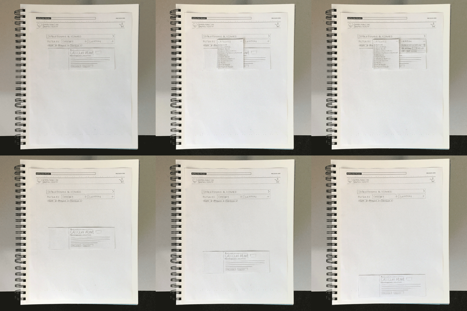
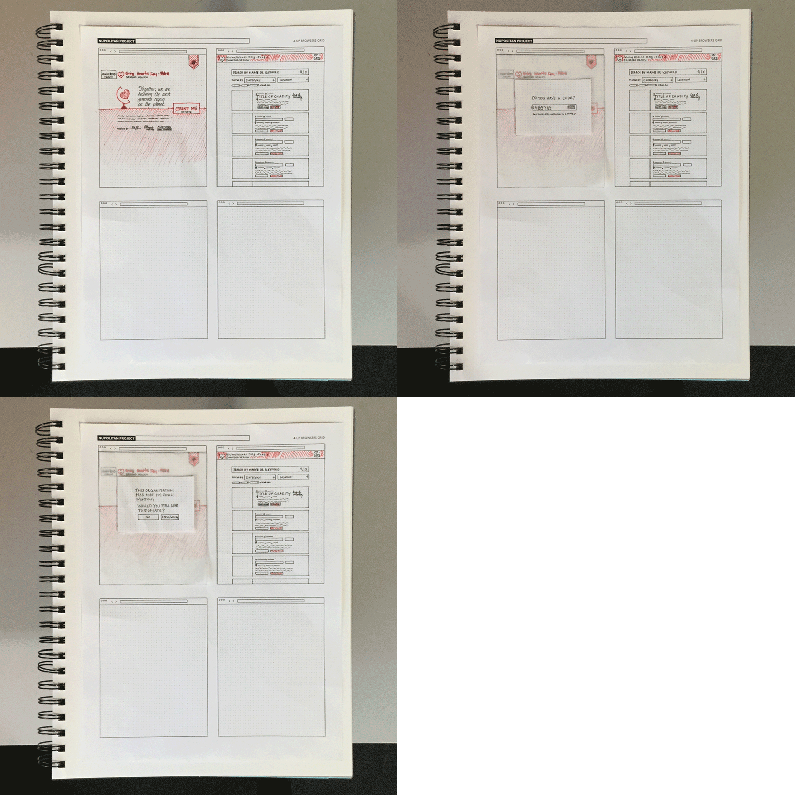
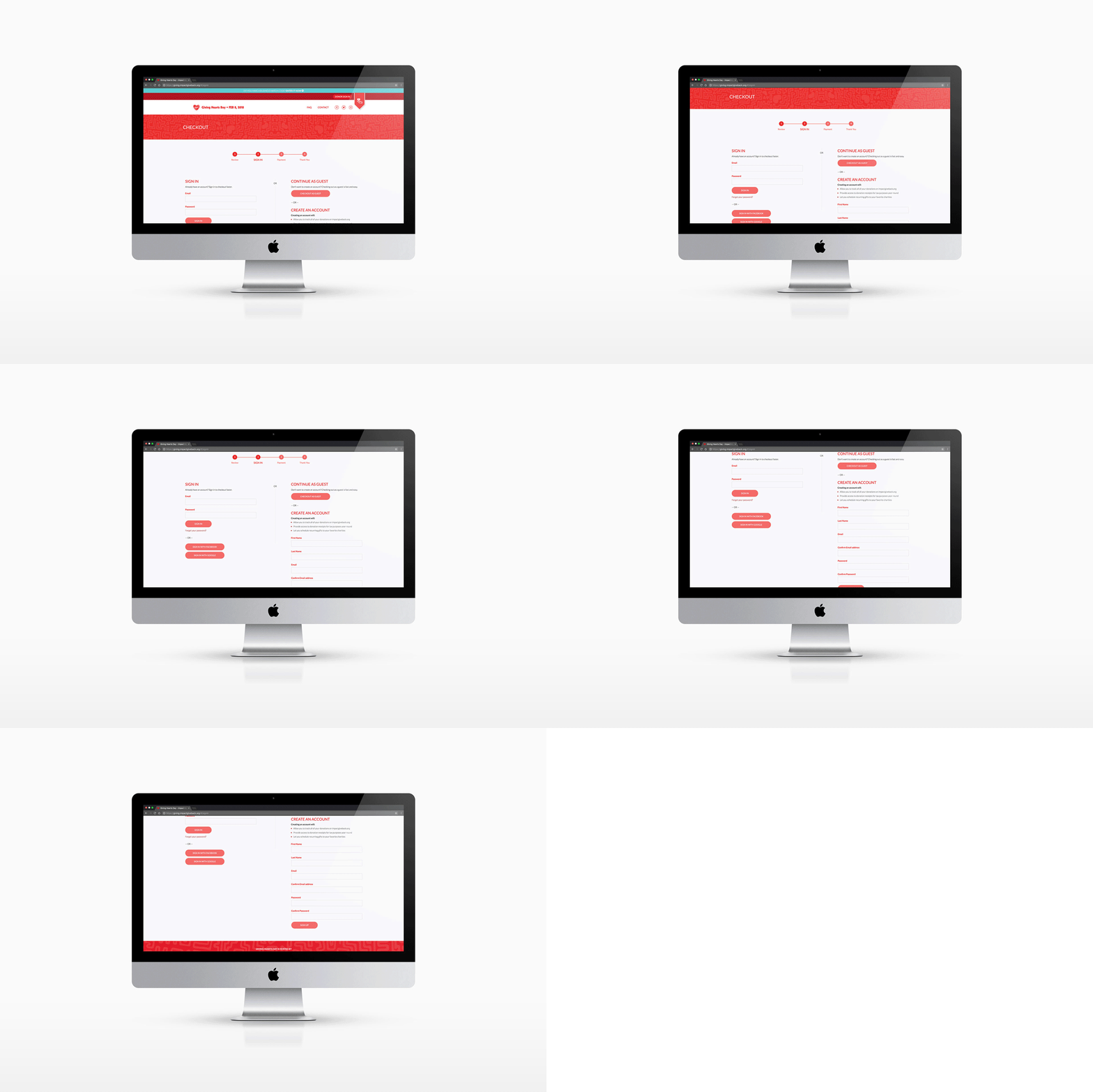
We collaborated with Object Partners, Inc. to revise and improve the UI/UX of DMF's existing donation platform used on Giving Hearts Day. Through exploration with the client, we discovered areas of the site that needed to be more intuitive and designed solutions to make the donation process easier for those interacting with the platform during the day of giving.
We redesigned interfaces to visually connect the existing platform to the newly created one-page site as well as reconfigured said interfaces to reflect industry standards and best practices for UI/UX.


Giving Hearts Day has been around since 2008, but until its 11th year, all online information regarding the event was housed in multiple locations spanning both DMF’s and its initiative, Impact Institute’s, websites. In addition to reworking the donation platform's usability, we were tasked with bringing all Giving Hearts Day content to one place in a simple and engaging one-page site.
The site’s use of happy and vibrant illustrations and colors was designed to get all who visited the site excited to participate and give back to the community. Based on the organization’s ethos and the project’s objectives, this solution was designed to be fun, modern, big, loud, established, structured, vibrant, and welcoming.


