The client described themselves as modern, refined, energetic, innovative, and welcoming. Based on the organization’s ethos and the project’s objectives, the supplementary materials, colors, typography choices, and stationery to accompany their existing logotype were created to be big, futuristic, vibrant, refined, simple, flexible, modern, methodical, elegant, and timeless.


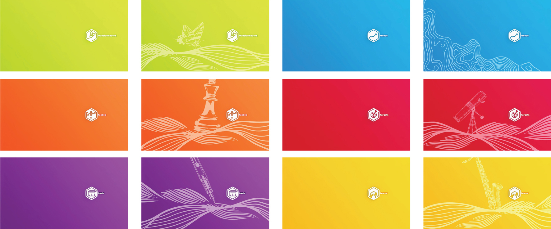
We designed a type strategy and layout grids for greater cohesion across all printed materials created for and distributed to Impact’s member organizations. Throughout the creation of various worksheets, articles, and printed packets, a library of iconography was created to reflect the organization’s activities and goals.


We designed bright and engaging business cards and letterhead as well as a series of postcards and posters featuring impactful and inspiring messaging written by the Institute.


Illustrations and floods of color were integrated into a series of images and banners for use on social media and in a refresh of the organization’s existing Wordpress site.