< Back to home

2016 // Design

Nü Branding

The summer of 2016 and the official launch of my and Ludvik Herrera’s full-time work in Nüpolitan, brought about a design audit to make sure we were expressing our brand consistently and cohesively across all channels. We explored many options and generated hundreds of iterations ranging from fun and friendly to simple and modern before honing into the version that became the mark you see today. We selected the classic Didot typeface as our typography base. Its timeless and discerning shapes and architecture reflect a well-crafted and refined design experience. The strong, clear forms display objective and rational characteristics and are used by numerous other fashionable brands - a testament to the flexibility and durability of this modern style.

Client: Nüpolitan

*Work done while with Nüpolitan

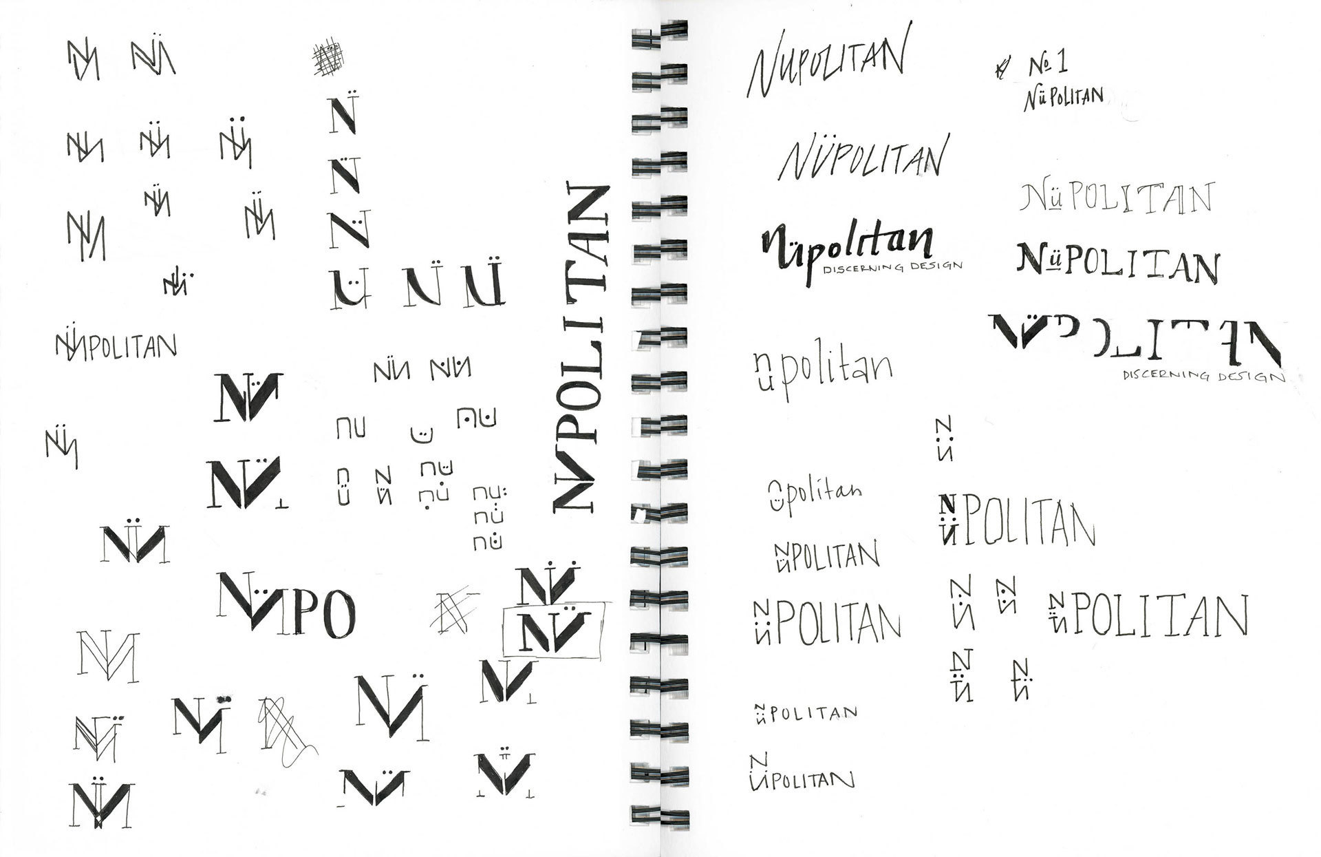
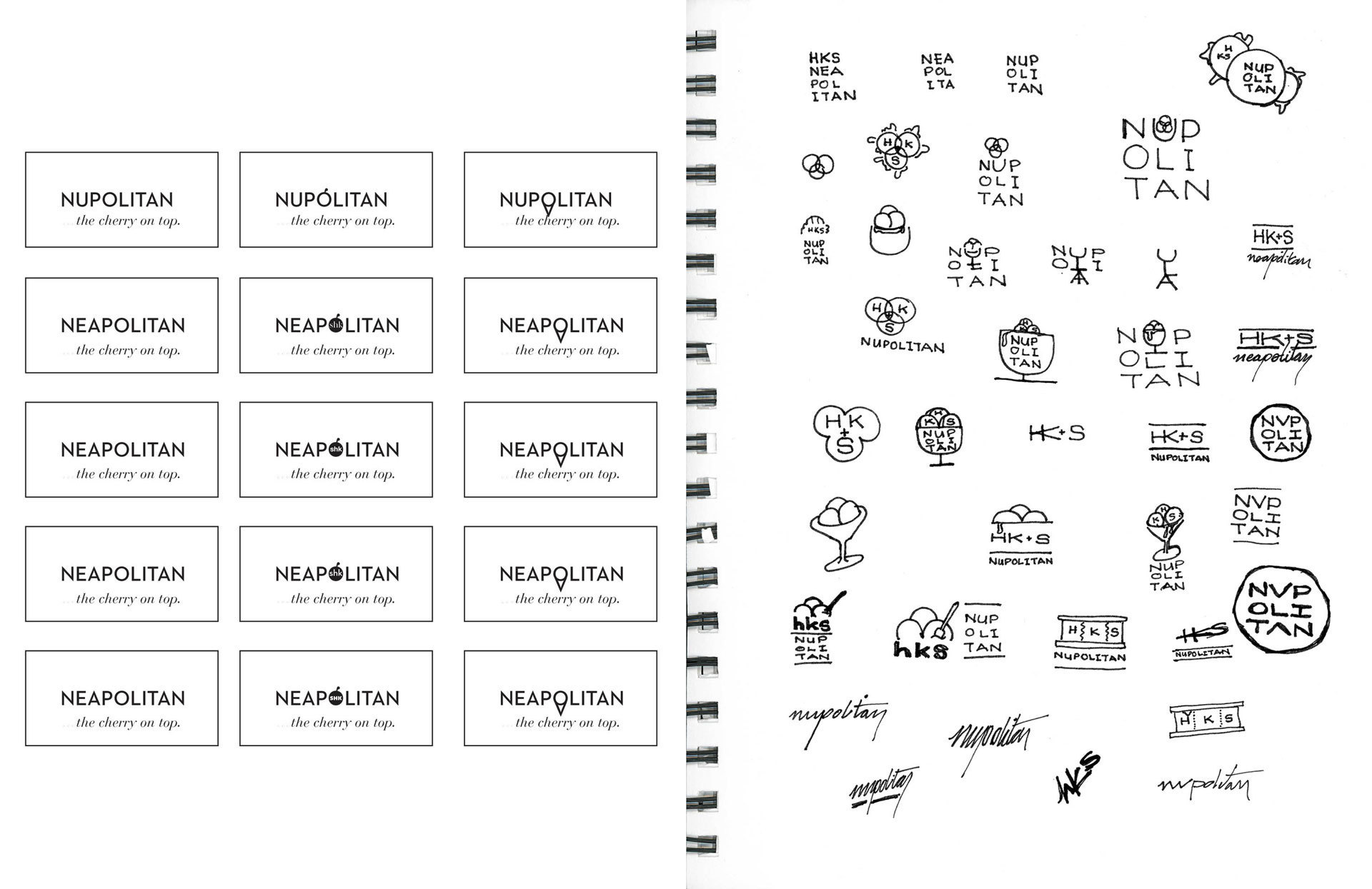
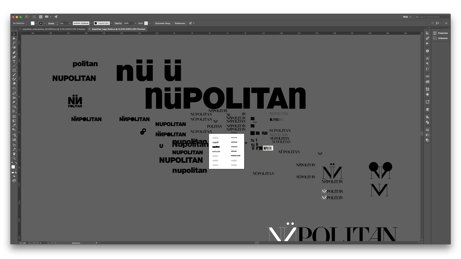
Highlighting and emphasizing the first part of the brand name, Nü, allowed us to play with powerful and intentional language as the agency strives to provide clients and collaborators with experiences entirely “nü” to them - like nothing they’ve experienced before.

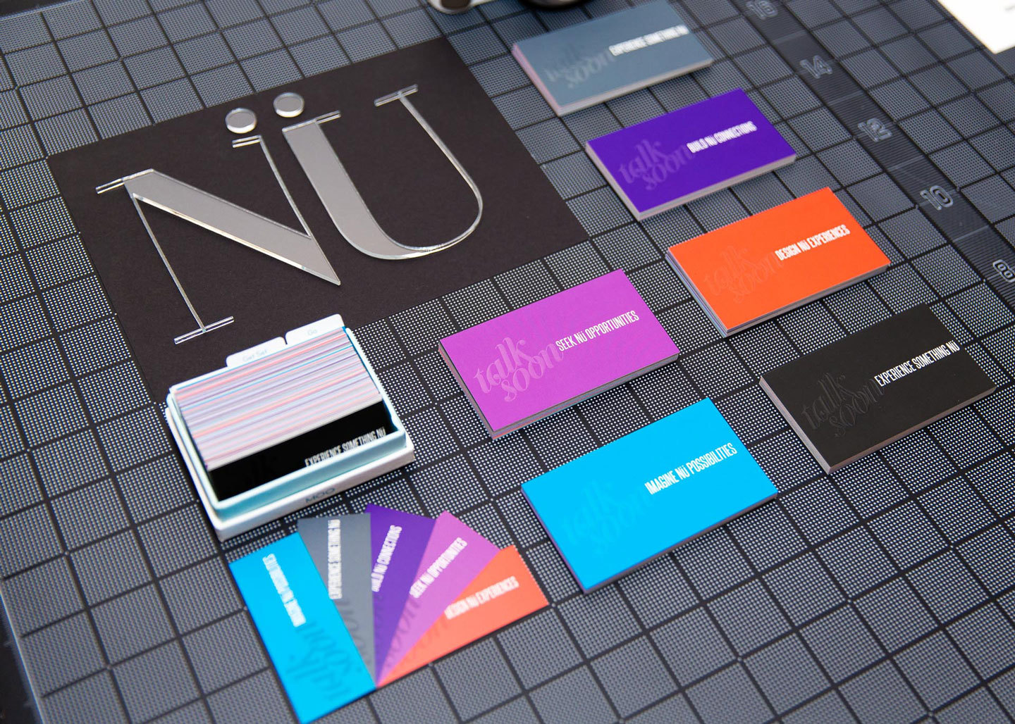
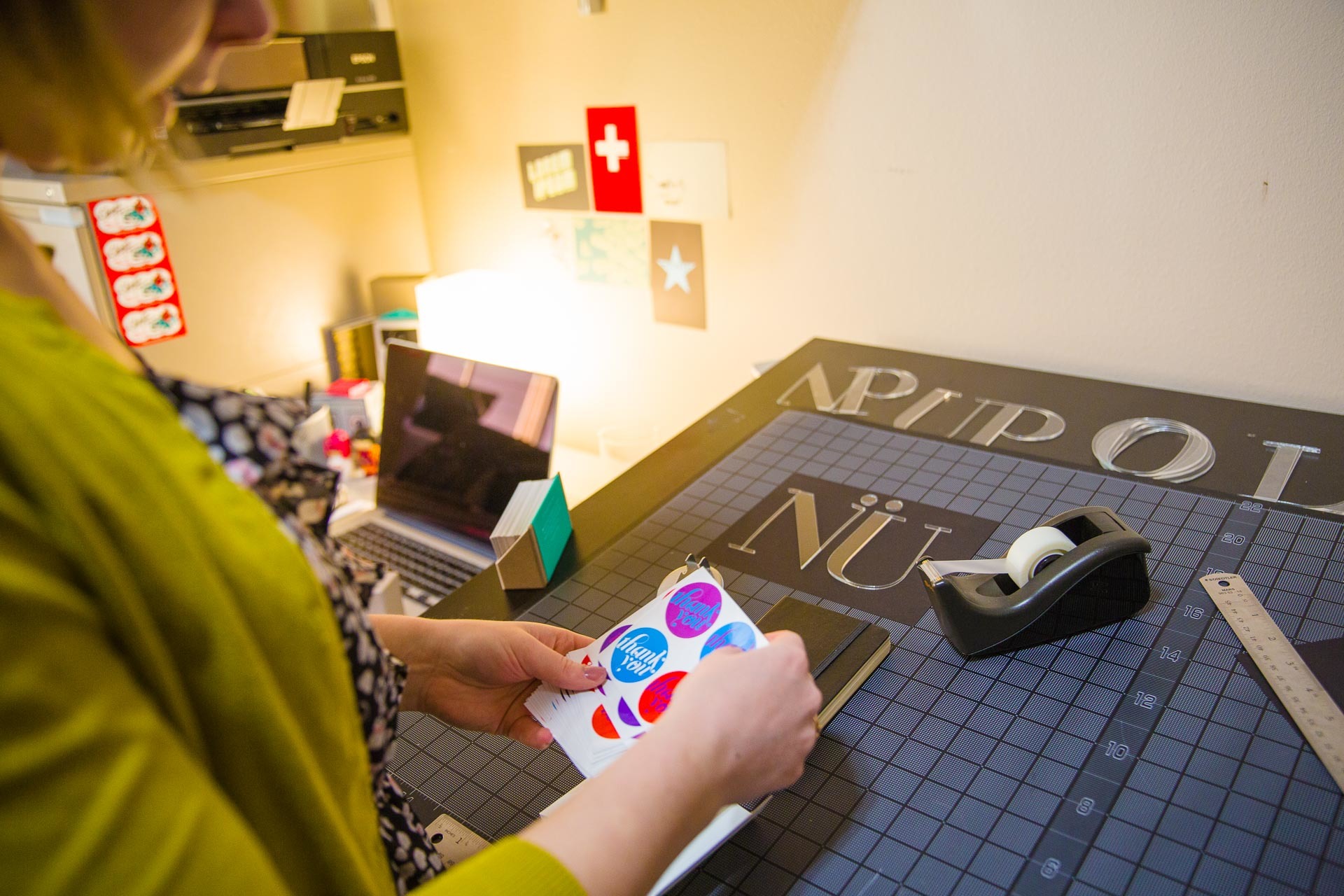
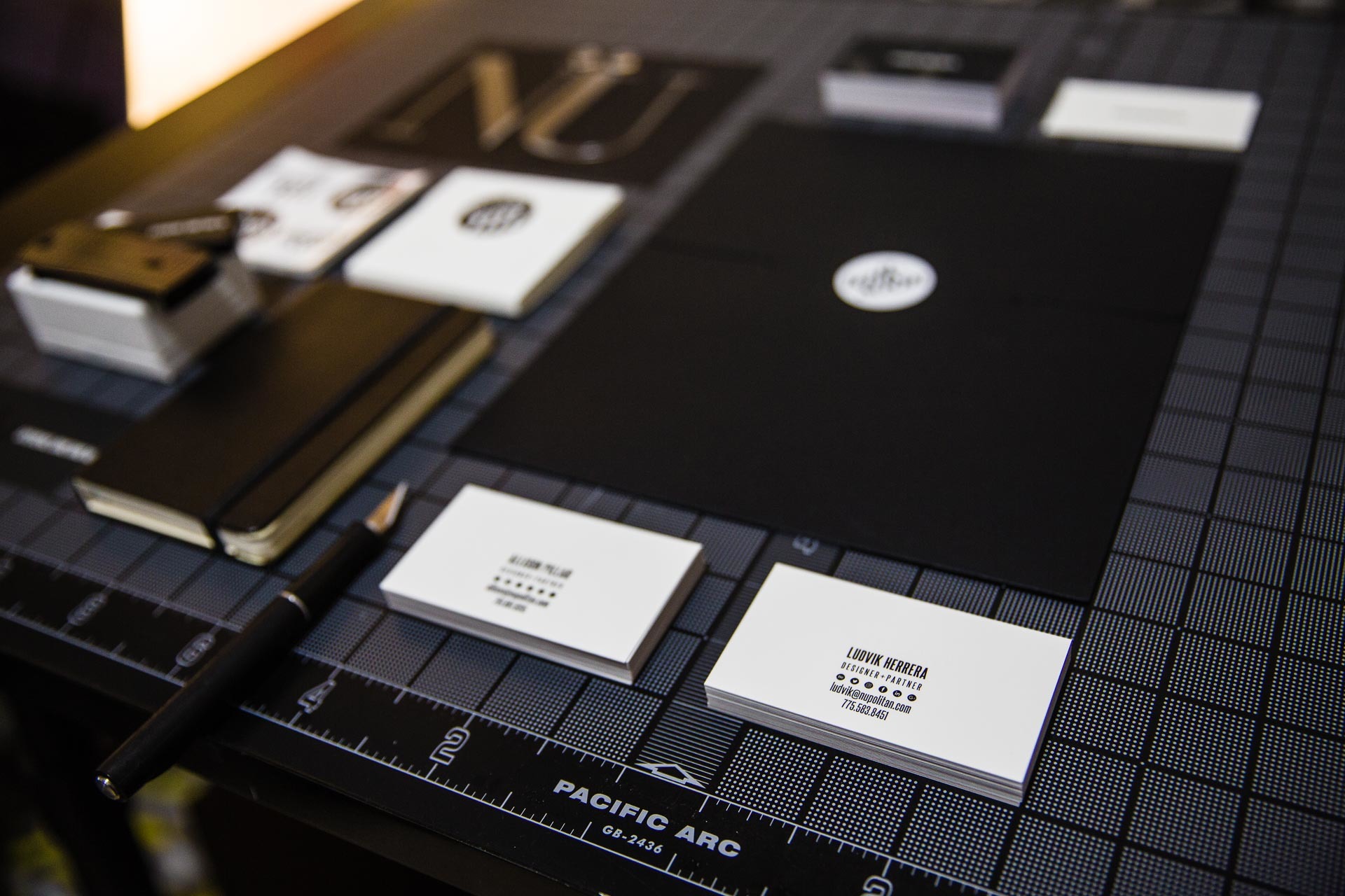
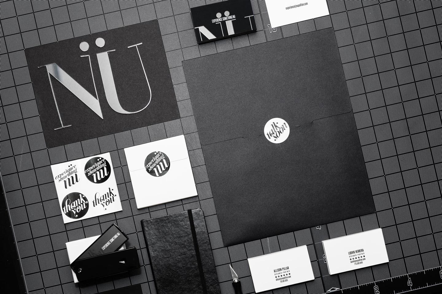
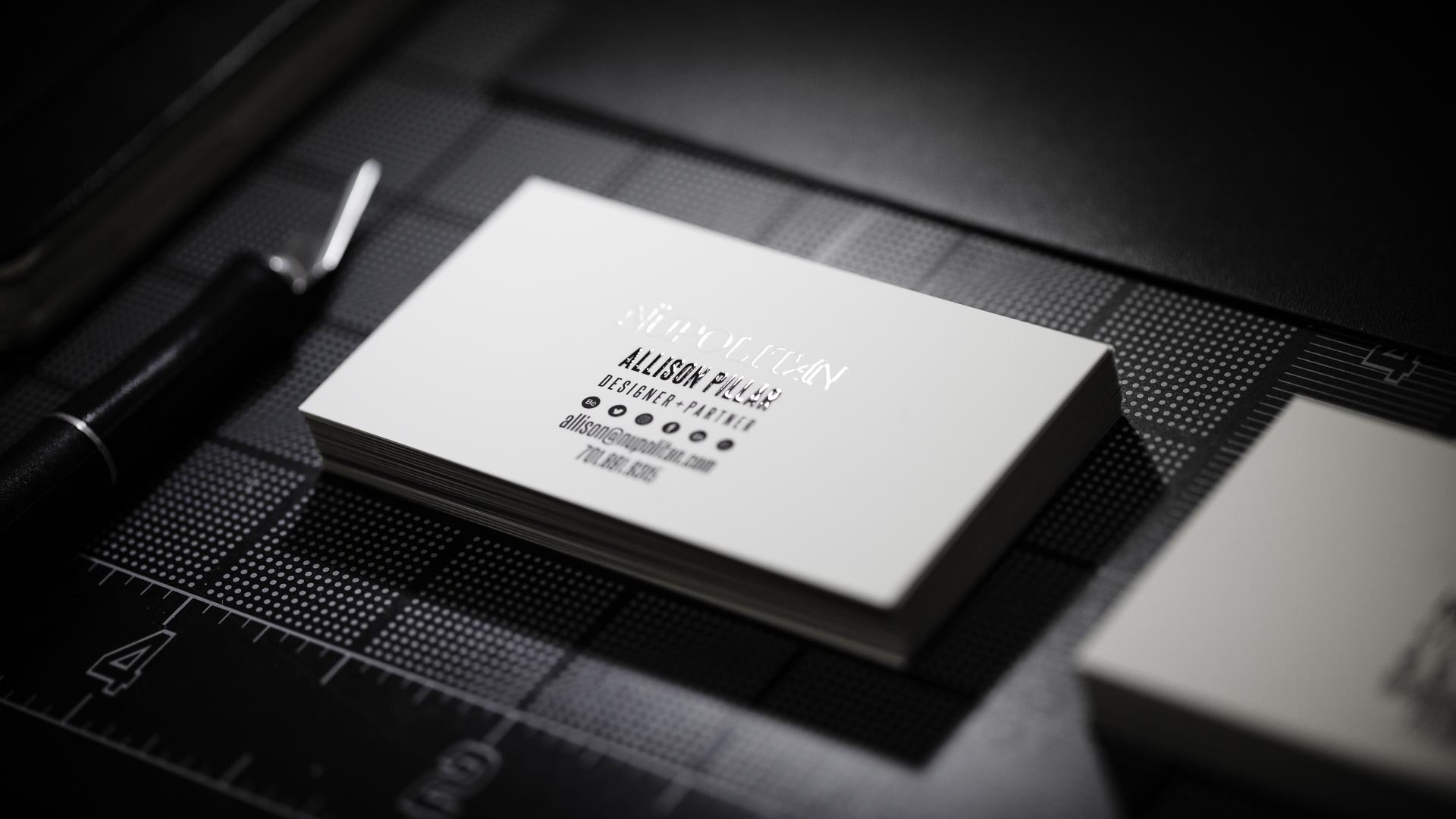
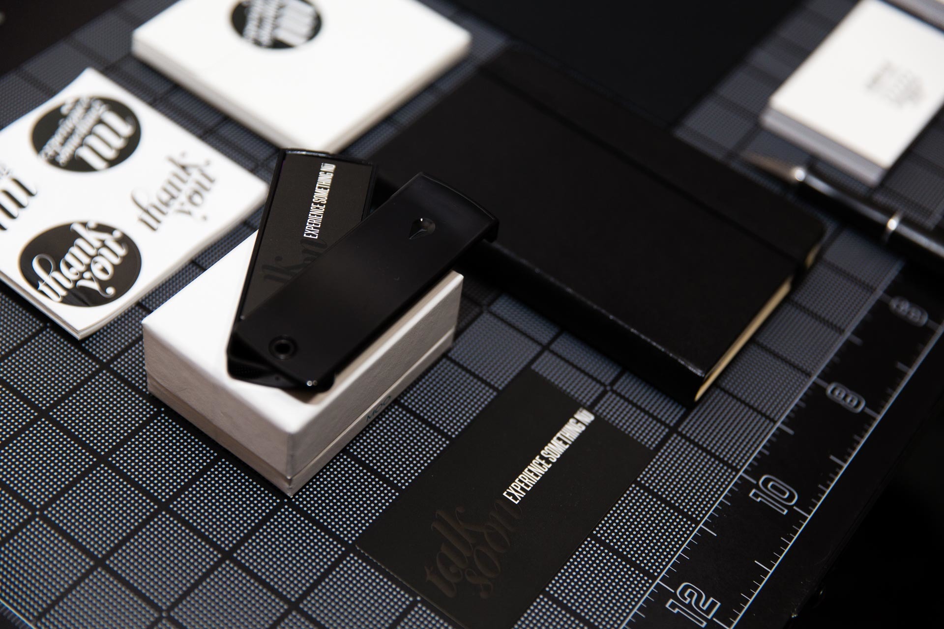
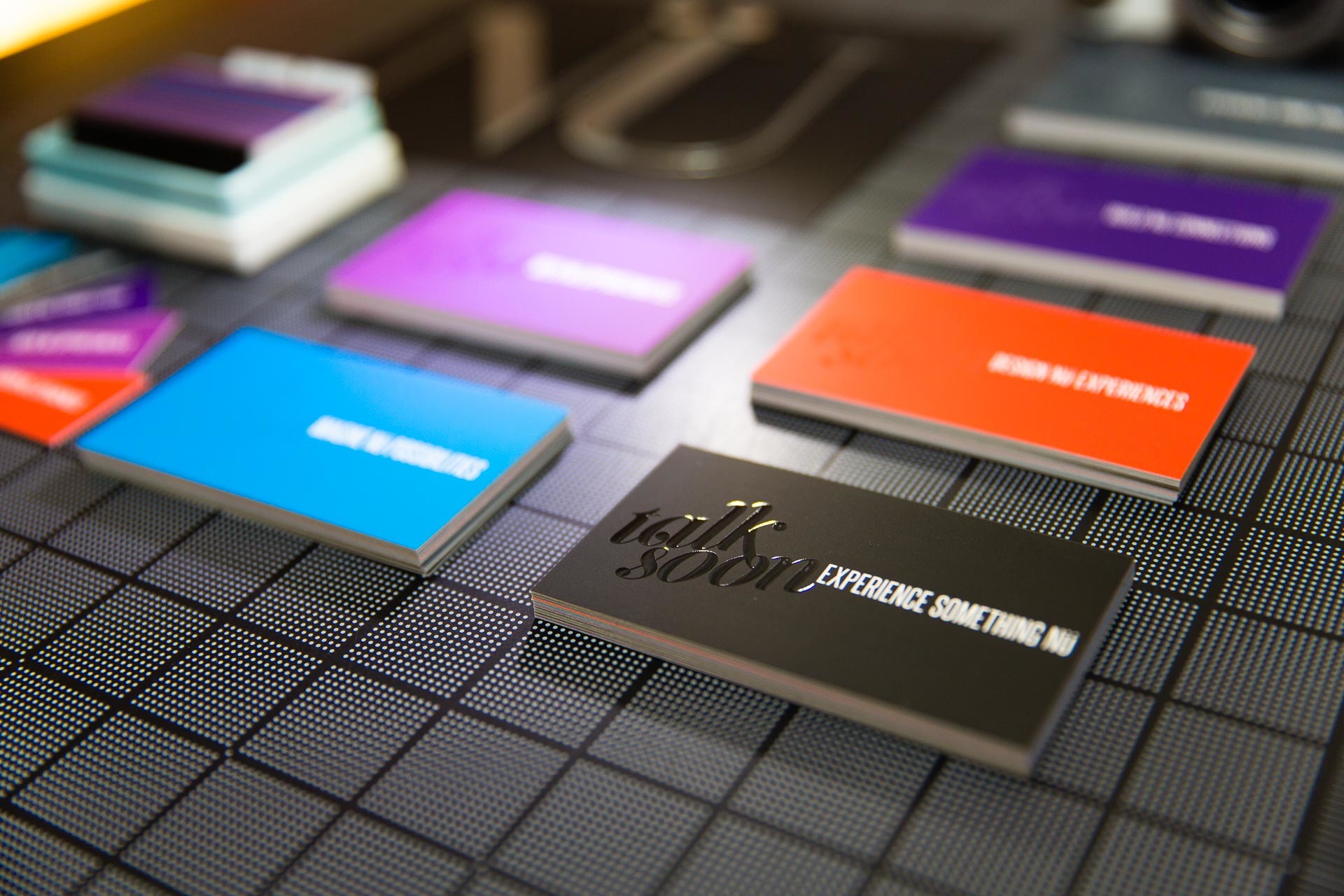
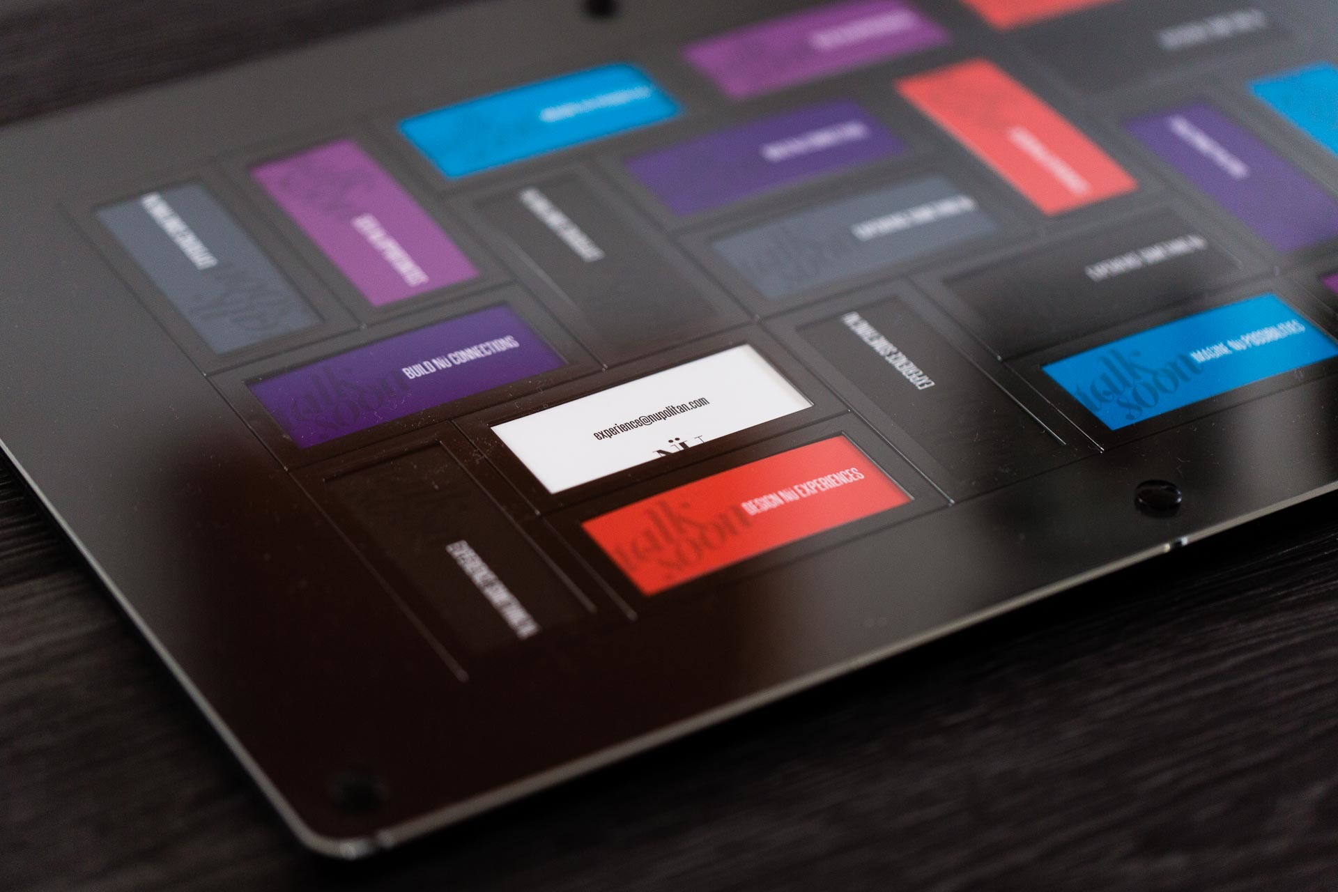
Considering all the senses, we wanted the cards to be a tactile experience and conversation piece - often leading to a piqued curiosity and desire to learn more about Nüpolitan’s process and work.